Homework08
Jay Sullivan
2025-03-19
Reading in Code
The code calls in the bacteria file to a z variable that can be called into other code. While also calling in our ggplot and MASS functions.
library(ggplot2) # for graphics
library(MASS) # for maximum likelihood estimation
z <- read.csv("2008_bacprods_Kling.csv",header=TRUE,sep=",")
str(z)
## 'data.frame': 252 obs. of 6 variables:
## $ SortChem : chr "2008-0020" "2008-0021" "2008-0022" "2008-0023" ...
## $ Site : chr "Toolik Inlet Bay" "Toolik" "Toolik Southwest Basin" "Toolik Moraine" ...
## $ Date : chr "26-May-08" "26-May-08" "26-May-08" "26-May-08" ...
## $ Time_hr_.DST. : chr "11:00" "11:45" "12:19" "12:45" ...
## $ Depth_m : num 5 5 5 5 5 5 5 5 5 5 ...
## $ Bac_prod_ug_C_L_day: num 2.91 2.26 2.29 2.39 2.2 ...summary(z)## SortChem Site Date Time_hr_.DST.
## Length:252 Length:252 Length:252 Length:252
## Class :character Class :character Class :character Class :character
## Mode :character Mode :character Mode :character Mode :character
##
##
##
## Depth_m Bac_prod_ug_C_L_day
## Min. : 0.010 Min. : 0.220
## 1st Qu.: 0.010 1st Qu.: 2.288
## Median : 1.000 Median : 4.940
## Mean : 2.944 Mean : 9.865
## 3rd Qu.: 5.000 3rd Qu.: 7.230
## Max. :16.000 Max. :165.110Plotting Histogram
The code below plots the data into a histogram.
p1 <- ggplot(data=z, aes(x=Bac_prod_ug_C_L_day, y=..density..)) +
  geom_histogram(color="grey60",fill="cornsilk",size=0.2)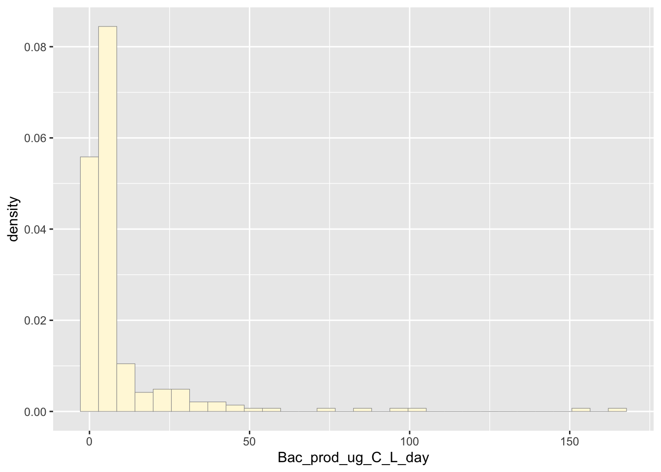
Empirical density curve
The code is supposed to show how the density of the group is reflected in the histogram
p1 <- p1 + geom_density(linetype="dotted",size=0.75)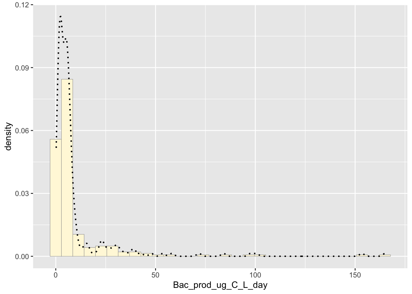
Maximum likelihood parameter for normal
The code finds the means and the standard deviation of the data.
normPars <- fitdistr(z$Bac_prod_ug_C_L_day,"normal")
print(normPars)
## mean sd
## 9.8645238 19.2252099
## ( 1.2110744) ( 0.8563589)str(normPars)## List of 5
## $ estimate: Named num [1:2] 9.86 19.23
## ..- attr(*, "names")= chr [1:2] "mean" "sd"
## $ sd : Named num [1:2] 1.211 0.856
## ..- attr(*, "names")= chr [1:2] "mean" "sd"
## $ vcov : num [1:2, 1:2] 1.467 0 0 0.733
## ..- attr(*, "dimnames")=List of 2
## .. ..$ : chr [1:2] "mean" "sd"
## .. ..$ : chr [1:2] "mean" "sd"
## $ n : int 252
## $ loglik : num -1103
## - attr(*, "class")= chr "fitdistr"normPars$estimate["mean"]## mean
## 9.864524## mean sd
## 9.8645238 19.2252099
## ( 1.2110744) ( 0.8563589)Normal Probability Density
The normal distribution of the data
meanML <- normPars$estimate["mean"]
sdML <- normPars$estimate["sd"]

xval <- seq(0,max(z$Bac_prod_ug_C_L_day),len=length(z$Bac_prod_ug_C_L_day))

stat <- stat_function(aes(x = xval, y = ..y..), fun = dnorm, colour="red", n = length(z$Bac_prod_ug_C_L_day), args = list(mean = meanML, sd = sdML))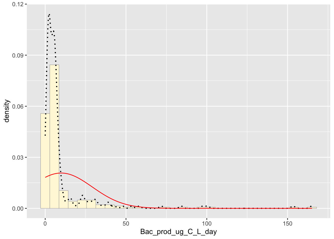
Exponential Probability Density
Plots the data as if it was in an exponential graph
expoPars <- fitdistr(z$Bac_prod_ug_C_L_day,"exponential")
rateML <- expoPars$estimate["rate"]

stat2 <- stat_function(aes(x = xval, y = ..y..), fun = dexp, colour="blue", n = length(z$Bac_prod_ug_C_L_day), args = list(rate=rateML))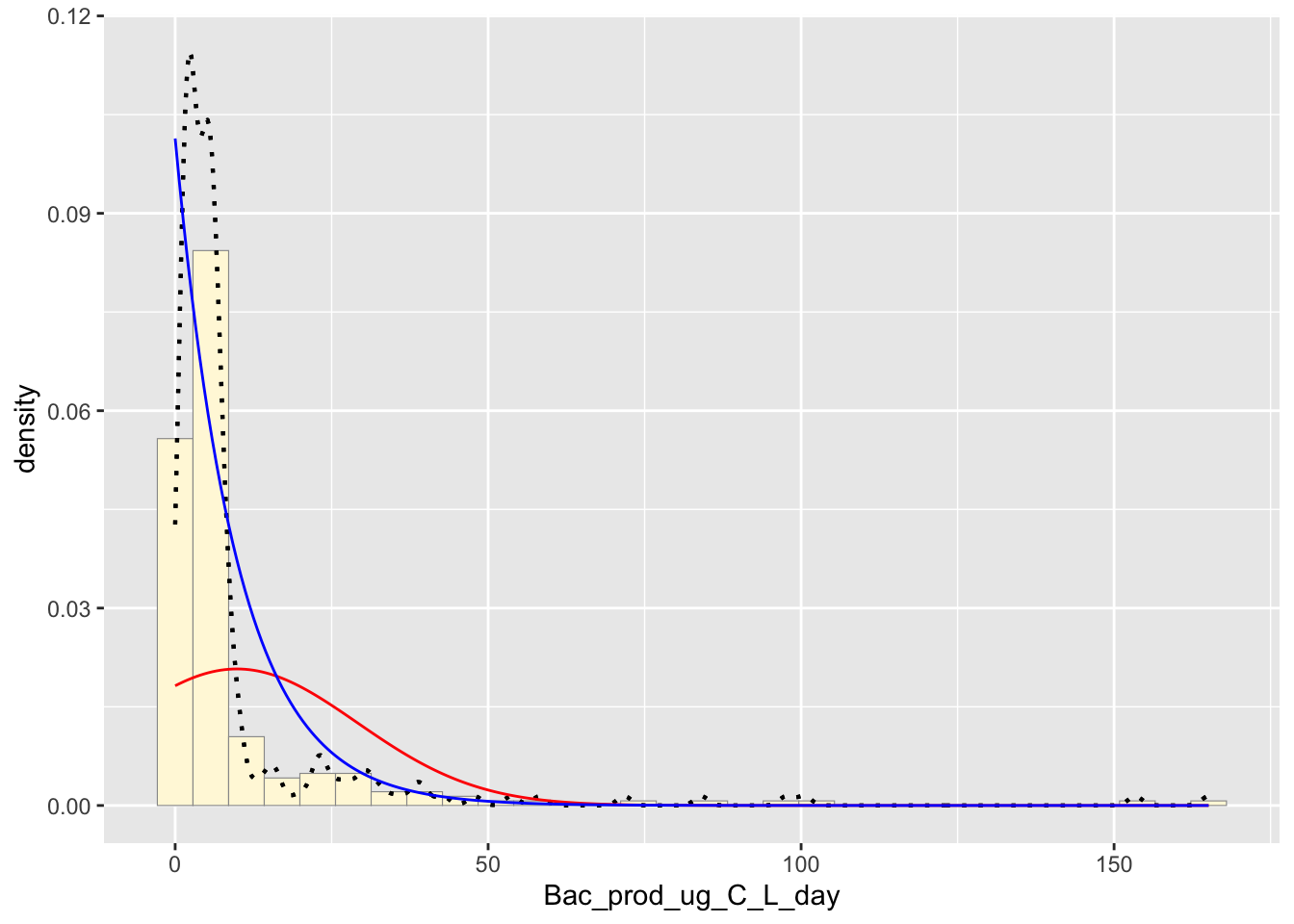
Uniform Probability Density
Plots the data as if it was a uniform graph
stat3 <- stat_function(aes(x = xval, y = ..y..), fun = dunif, colour="darkgreen", n = length(z$Bac_prod_ug_C_L_day), args = list(min=min(z$Bac_prod_ug_C_L_day), max=max(z$Bac_prod_ug_C_L_day)))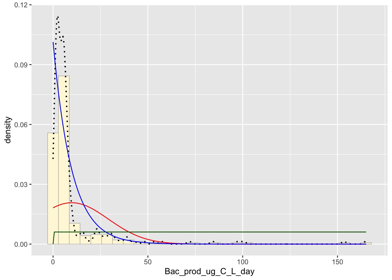
Gamma Probability Density
Plots the data similarly like the exponential function.
gammaPars <- fitdistr(z$Bac_prod_ug_C_L_day,"gamma")
shapeML <- gammaPars$estimate["shape"]
rateML <- gammaPars$estimate["rate"]

stat4 <- stat_function(aes(x = xval, y = ..y..), fun = dgamma, colour="brown", n = length(z$Bac_prod_ug_C_L_day), args = list(shape=shapeML, rate=rateML))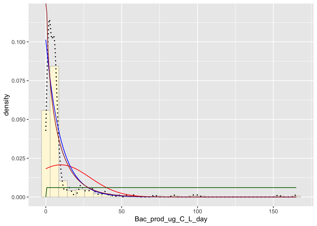
Beta Probability Density
Raw data is scaled to either zero or one.
pSpecial <- ggplot(data=z, aes(x=Bac_prod_ug_C_L_day/(max(Bac_prod_ug_C_L_day + 0.1)), y=..density..)) +
  geom_histogram(color="grey60",fill="cornsilk",size=0.2) +
  xlim(c(0,1)) +
  geom_density(size=0.75,linetype="dotted")

betaPars <- fitdistr(x=z$Bac_prod_ug_C_L_day/max(z$Bac_prod_ug_C_L_day + 0.1),start=list(shape1=1,shape2=2),"beta")
shape1ML <- betaPars$estimate["shape1"]
shape2ML <- betaPars$estimate["shape2"]

statSpecial <- stat_function(aes(x = xval, y = ..y..), fun = dbeta, colour="orchid", n = length(z$Bac_prod_ug_C_L_day), args = list(shape1=shape1ML,shape2=shape2ML))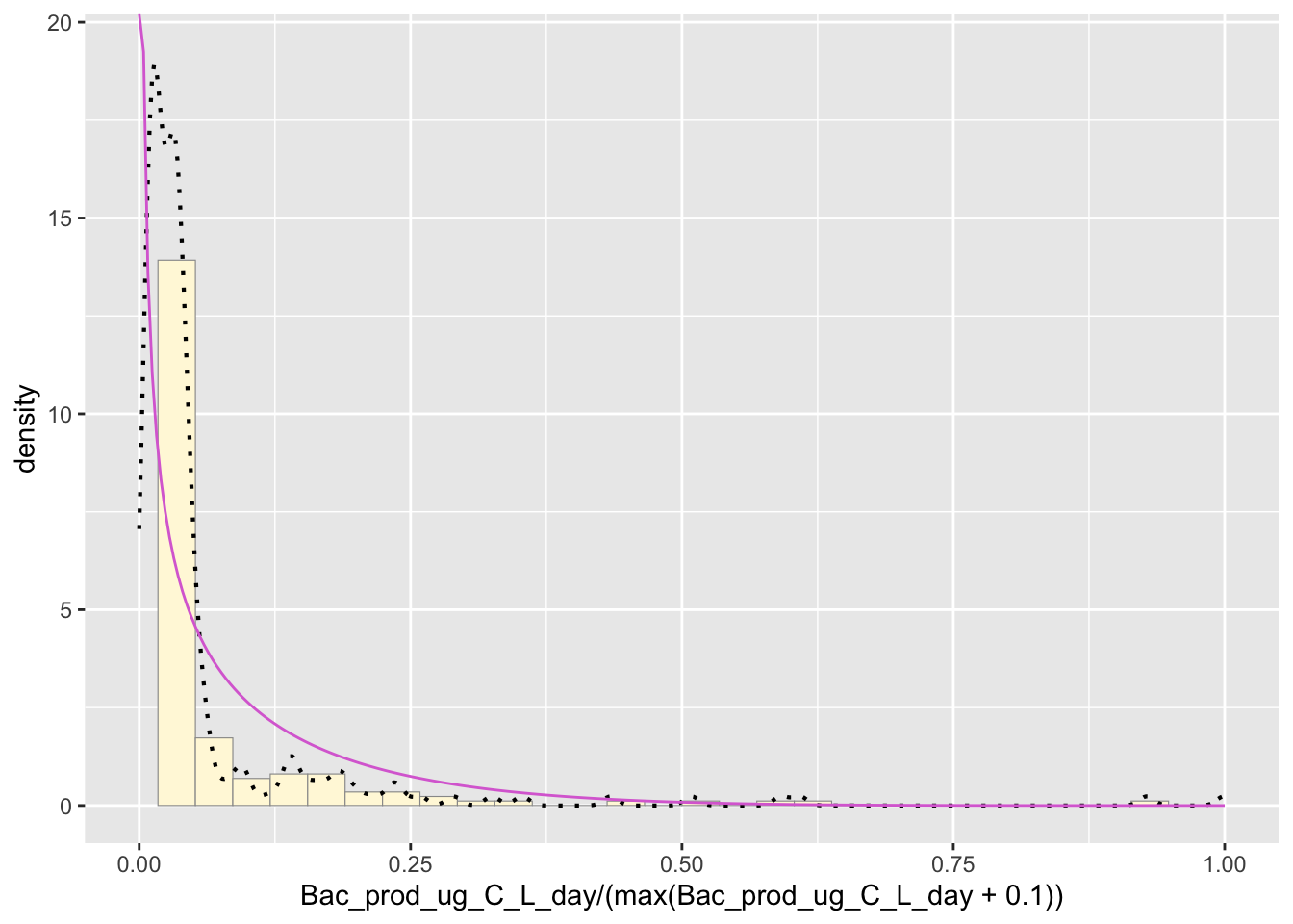
Best Fitting Distribution
The best fitting distribution would have to be empirical density curve due to the way it follows the trend of the data.
Simulating New Data Set
This code makes a randomly generated data set of 200 specimens.
The code also finds the quartile ranges as well as the median and mean.
## 'data.frame':    1720 obs. of  2 variables:
##  $ ID   : int  1 3 4 5 7 9 12 15 16 17 ...
##  $ myVar: num  0.21 0.251 1.334 0.986 0.694 ...
## Min. 1st Qu. Median Mean 3rd Qu. Max.
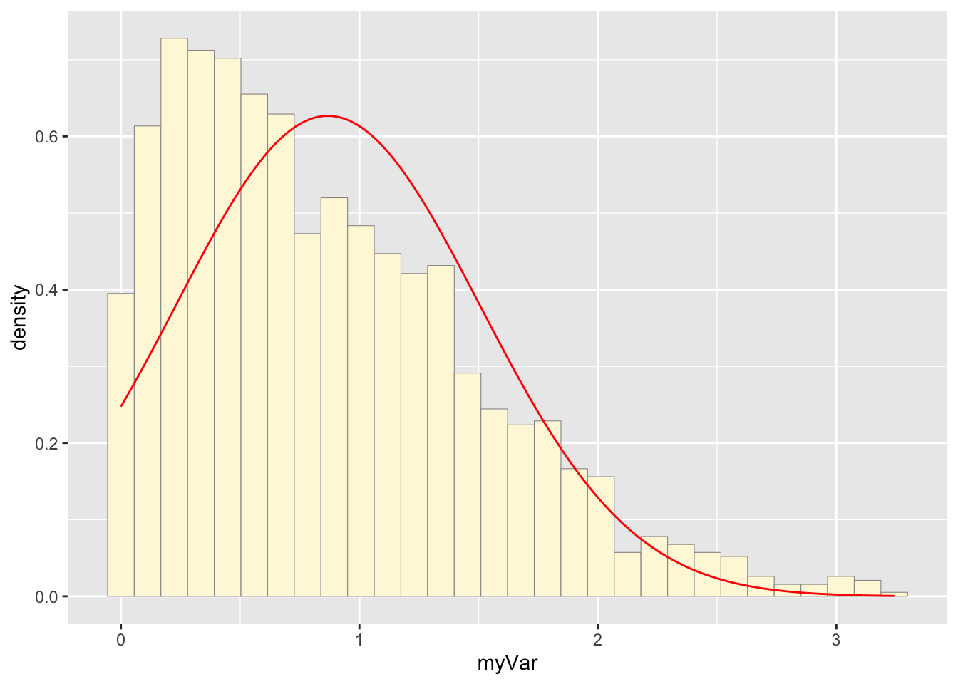
## 0.000533 0.355140 0.734071 0.867646 1.259622 3.242697This code plots the random data set.
p1 <- ggplot(data=nd, aes(x=myVar, y=..density..)) +
  geom_histogram(color="grey60",fill="cornsilk",size=0.2)
print(p1)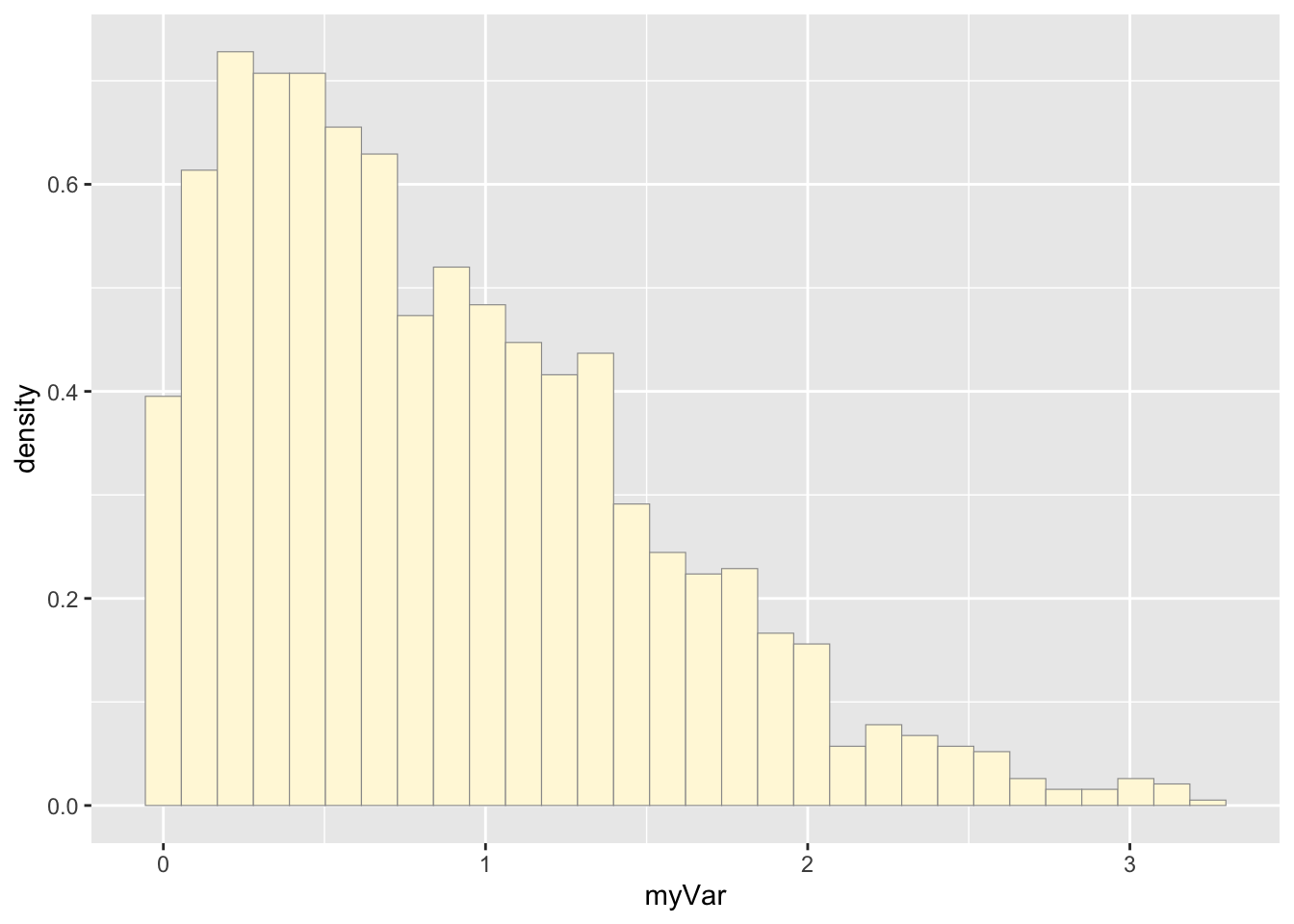
This code creates the normal probability density which best fits the data.
normPars <- fitdistr(nd$myVar,"normal")
meanML <- normPars$estimate["mean"]
sdML <- normPars$estimate["sd"]

xval <- seq(0,max(nd$myVar),len=length(nd$myVar))

stat <- stat_function(aes(x = xval, y = ..y..), fun = dnorm, colour="red", n = length(nd$myVar), args = list(mean = meanML, sd = sdML))
p1 + stat